HomeBlogBlogWarm-Neutral Table Styling: Minimal Steps + Checklist

Warm-Neutral Table Styling: Minimal Steps + Checklist

Warm-Neutral Table Styling: Minimal Steps + Checklist

Warm-Neutral Table Styling: A Minimalist Guide with a Printable Checklist

Warm neutrals create a table that feels calm, welcoming, and elevated without looking fussy. The sweet spot is a tight palette (creams, sands, taupes, caramel, soft terracotta), a few repeated textures, and a centerpiece that looks intentional instead of “added on.” Use the steps below to build a layered look that works for everyday meals, hosting, or a seasonal refresh—then keep it consistent with a printable checklist you can reuse. For more guidance, see Neutral Color Palettes to Match Any Style | ArchitectureCourses.org.

Start with a warm-neutral palette that stays cohesive

A minimalist warm-neutral table isn’t about having fewer pieces—it’s about fewer decisions. Start by choosing undertones that naturally sit together, then repeat them across the table. For further reading, see How to Style 3 Stunning Neutral Table Settings.

  • Pick 2–3 base neutrals for the largest surfaces: ivory/cream, oatmeal, warm gray, or light taupe (tablecloth, runner, placemats).
  • Add 1 accent neutral for depth: camel, cognac, chocolate, or muted terracotta, reserved for smaller items like napkins or candles.
  • Choose one metal tone and repeat it: brushed brass and warm bronze amplify warmth; matte black adds contrast but should appear sparingly.
  • Aim for a low-contrast look: keep most items in a similar light-to-medium value range, then add one darker anchor (wood board, dark candle, or woven charger).
  • Avoid mixing too many undertones. If you introduce a cooler warm gray, balance it with natural wood and warm candlelight.

Warm-Neutral Pairings That Look Intentional

Base neutrals Accent Best textures Works well for
Ivory + Oatmeal Caramel Linen, oak, rattan Everyday minimal hosting
Cream + Warm Taupe Soft Terracotta Stoneware, matte ceramics Fall dinners, rustic modern
Sand + Mushroom Brass Textured glass, brushed metal Evening gatherings
Ecru + Warm Gray Matte Black (small doses) Cotton, smoked glass Modern minimal look
Natural Linen + Bone Cognac Leather Leather, wood, linen Statement place settings

If you want a quick reference for undertones and how they read in different settings, the color guidance from Pantone Color Institute and Sherwin-Williams Color Education can help you spot the difference between warm ivory and cooler off-white before you buy.

Build the base layer: cloth, runner, and placemats

The base layer sets the “quiet background” that makes everything else look curated.

  • Choose one foundation: either a tablecloth (soft, enveloping) or placemats (clean, graphic). Pairing both can work, but only if one is subtle and the other is very simple.
  • For a minimalist tablecloth, prioritize drape and texture over pattern: washed linen, cotton slub, or a lightly nubby weave reads elevated without shouting.
  • Use a runner only when it adds structure. Center it to frame a centerpiece line; skip it if your tabletop has beautiful grain or a statement finish.
  • Keep edges tidy. Ironed napkins and a smooth runner instantly feel more polished, even when the dinnerware is casual.

Choose dinnerware that looks calm, not flat

Warm neutrals can risk looking “beige on beige” if everything is the same tone and finish. The fix is subtle variation.

  • Stick to simple silhouettes: coupe plates, straight-sided bowls, and low-profile serving pieces keep the look modern and uncluttered.
  • Go tonal: cream plates with slightly darker bowls add depth without visual noise.
  • Introduce one organic element: a stoneware rim, speckled glaze, or hand-thrown shape adds warmth to an otherwise clean palette.
  • If mixing sets, unify them with one shared trait (same finish, same tone, or the same rounded shape language).

Add texture through napkins, chargers, and natural materials

Think of texture as your “pattern” in a minimalist palette.

  • Use napkins as the main soft accent: warm sand, camel, or muted clay looks effortless against cream plates.
  • Choose one textured hero—woven chargers, a jute runner, linen napkins, or ribbed glass—then keep everything else quiet.
  • Create contrast with finish, not color: matte ceramics with glossy glassware, or smooth plates with nubby linen.
  • Keep place cards and menus minimal: off-white cardstock, warm-gray ink, and a small sprig or knot of twine is enough.

Centerpiece rules for minimalist warm neutrals

A warm-neutral centerpiece should feel like part of the table, not a separate project.

Lighting that makes warm neutrals glow

Quick setups for different moments

For more inspiration on how designers keep tables sophisticated without over-styling, browse features from Architectural Digest and note how often they repeat one texture and one metal finish.

Printable checklist to keep styling effortless

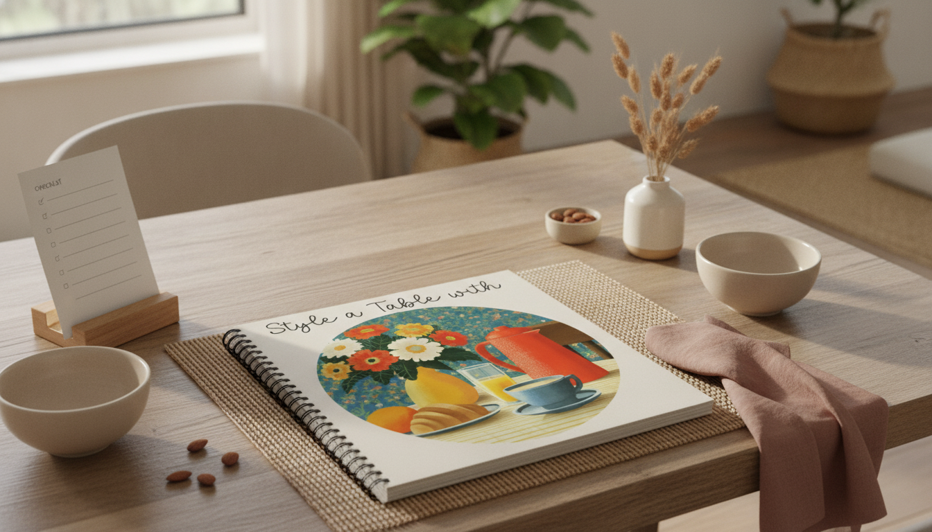
Warm-neutral table styling printable checklist

If you love printable systems for keeping home routines simple, you may also like: Car Cleaning Hacks to Keep Your Ride Fresh – Digital Checklist and Home Cardio Blast Checklist | Instant Digital Download.

Common mistakes that make warm neutrals feel messy

FAQ

What colors count as warm neutrals for table styling?

Creams, ivories, sand, oatmeal, warm taupe, camel, caramel, cognac, and soft terracotta all read warm-neutral. Pay attention to undertones (yellow, peach, or red warmth vs. cooler gray) and remember candlelight will make warm shades look richer and more cohesive.

How do warm neutrals stay interesting without using bold color?

Rely on texture layering (linen, stoneware, wood, ribbed glass) and finish contrast (matte ceramics with glossy glass). Add one darker anchor—like a wood board or deep bronze candleholder—to give the table definition without introducing bright color.

How many items should be in a minimalist centerpiece?

Use one focal idea and keep it to about 3–5 grouped elements max. Keep everything low, and contain it on a tray or board so the centerpiece feels tidy and intentional rather than scattered.

Was this article helpful?

Yes No
Leave a comment
Top

Shopping cart

×