AI can speed up ideation, help you explore styles, and generate strong starting points—but “fast” doesn’t automatically look finished. Professional-looking results come from deliberate constraints, solid references, controlled generation, and a repeatable refinement workflow. Use the checklist below to keep your artwork consistent, export-ready, and safe for real-world use.
Set the Foundation: Style, Purpose, and Constraints
Before generating anything, define what “done” looks like. Different deliverables demand different decisions early, and these choices prevent rework later.
- Define the deliverable: print poster, web hero, social carousel, game asset, concept sheet, or a client presentation.
- Pick a clear style direction: realism, anime, painterly, low-poly, or editorial illustration—then list 3–5 non-negotiables (palette, mood, brush feel, era, texture level).
- Lock format requirements: aspect ratio, target resolution, color space (sRGB vs CMYK), and background needs (transparent, solid, or environmental).
- Create a “do-not” list: banned motifs, restricted brands, unwanted lighting, overly busy textures, and common anatomy pitfalls you’ll watch for.
- Decide what stays human: choose what will be AI-generated versus hand-edited to preserve a recognizable personal look.
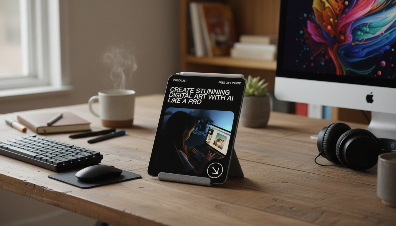
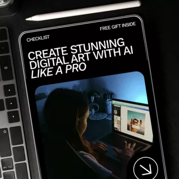
If you want a printable, repeatable workflow you can reuse across projects, grab the Ultimate AI digital art checklist (instant download) and keep it next to your canvas while you work.
Reference and Moodboarding That Actually Improves Outputs
High-quality references don’t limit originality—they help you be intentional. One image rarely solves composition, lighting, materials, and anatomy all at once, so build a small library that does.
- Collect references by category: separate folders for composition, lighting, materials, anatomy, wardrobe, and environments.
- Annotate specifics: camera angle, lens feel, key light direction, rim light intensity, texture cues, and color temperature.
- Build a mini style guide: 6–12 color swatches, 3 texture samples, and 2–3 composition examples you want to emulate structurally (not copy).
- Use reference responsibly: avoid replicating a living artist’s signature look; aim for broader attributes and your own composition choices.
- Keep a project folder structure: /refs, /generations, /edits, /exports, /licenses.
Generation Checklist: Control Composition, Lighting, and Consistency
Generation is where many projects drift. Treat it like a controlled experiment: lock the big picture first, then improve in small, trackable steps.
- Start with composition: subject placement, negative space, silhouette clarity, and horizon line come before texture polish.
- Specify camera and lighting: viewpoint, depth of field, key/fill/rim placement, and time-of-day so forms read cleanly.
- Iterate in small steps: change one major variable per run (pose OR lighting OR background) to learn what actually helps.
- Use consistency tools: seeds, style references, and character sheets can reduce face/outfit/palette drift across images.
- Generate at a sensible base size: upscale later, after anatomy and perspective are corrected.
Fast Generation Controls (What to Change First)
| Goal |
Adjust First |
Why It Helps |
| Cleaner composition |
Camera angle + framing |
Improves readability before detail polish |
| More cinematic depth |
Lighting direction + contrast |
Creates form separation and mood |
| Consistent character |
Seed/style reference + outfit notes |
Reduces face/outfit drift between iterations |
| Less clutter |
Background simplicity + negative space cues |
Keeps attention on the subject |
| More believable materials |
Material keywords + reference textures |
Fixes “plastic” or muddy surfaces |
Refinement Workflow: From “Good” to Portfolio-Ready
Refinement is where AI-assisted art starts looking intentional. Choose the strongest base image, then do targeted corrections in a consistent order.
- Select the best candidate: prioritize silhouette, gesture, and lighting clarity—not tiny details you can fix later.
- Fix anatomy and perspective early: paint-over, warp, and liquify tools are fastest before upscaling magnifies errors.
- Clean edges and reduce noise: simplify hair clumps, remove random artifacts, and unify texture scale across the piece.
- Unify color grading: apply one overall grade/LUT approach, then fine-tune skin tones, shadows, and highlights. For deeper color workflow guidance, reference Adobe’s color management documentation.
- Add intentional focal detail: sharpen around the primary subject (often eyes/face), while softening secondary areas to control attention.
Text, Logos, and Product Details: Avoid the Usual Traps
Even great images can look amateur if typography, marks, or print specs are mishandled.
Rights, Attribution, and Commercial Use Checks
- Review the tool’s terms: confirm commercial usage permissions, training-data notes, and any attribution requirements.
- Avoid protected content: don’t use recognizable trademarks, celebrity likenesses, or protected characters in commercial projects without permission. For trademark basics, see the USPTO guidance.
- Keep a provenance log: tool used, date, key settings, and editing steps—useful for clients and future updates.
- Clarify ownership in writing: especially if you’re delivering layered files or collaborating across a team.
- Include a license note for downloads: define personal vs commercial use and list prohibited uses clearly.
When you’re creating work intended for registration or formal documentation, review the U.S. Copyright Office registration guidance for current requirements and best practices.
Deliverables and Export Checklist
Printable Checklist for Repeatable Results
For creators who like structured systems, you may also want to browse other downloadable checklists like Home Cardio Blast Checklist (instant download) for building consistent habits across projects—not just art.
FAQ
What’s the fastest way to make AI art look more professional?
Prioritize composition and lighting first, then do a focused paint-over pass to correct anatomy, clean edges, and unify color grading. Finish by sharpening only at the focal point so the image feels intentional, not uniformly “crunchy.”
Can AI-generated art be used commercially?
It depends on the tool’s terms and the content you include. Confirm commercial permissions, avoid trademarks/celebrity likenesses/protected characters without permission, and keep a simple provenance log for client-facing work.
How can character designs stay consistent across multiple images?
Use a character sheet, fixed palette and outfit notes, and consistency controls like seeds or style references when available. Change one major variable at a time and keep a small library of approved faces, poses, and outfits to reuse.
Recommended for you

Leave a comment